Sector
Fintech
Position
Lead product designer
Duration
Six months
Scope
User research, interaction design, prototyping, usability testing, design system
Overview
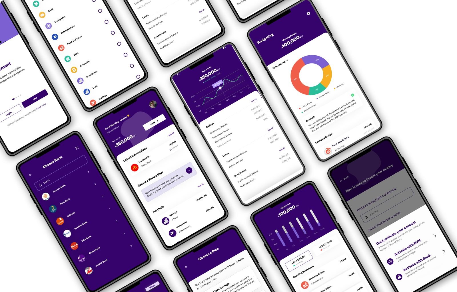
A digital banking and money management platform for individuals and businesses across Africa, holding banking, goal based saving, investment, budgeting and access to credit in one app. That breadth is the design problem: six product areas used by people ranging from confident investors to someone opening their first account, all of it needing to stay readable rather than intimidating. The commitment behind the product shaped how we worked: understand what members were actually struggling with first, then solve it.
I was the first designer on the project, working directly with the founders from research through to launch, alongside a team of two developers and a graphic artist/illustrator.
The challenge
People have traditionally relied on conventional methods for saving, but the returns rarely keep pace with inflation. That gap is the reason the app exists, and it set the bar for what the product had to do.
The app needed to differentiate itself in a crowded fintech space while offering a seamless way to monitor and manage an investment portfolio. The design had to be sophisticated yet approachable, conveying trust and simplicity at the same time.
Project objectives
- Create a brand that feels trustworthy and modern without being intimidating.
- Build an app that makes complicated financial information, such as how an investment is performing, easy to read at a glance.
- Keep people coming back, by making the app easy to find your way around and clear about what matters most on each screen.
- Make sure every design decision served the business as well as the person using the app.
Process
Four stages: understanding the problem, defining it precisely, exploring solutions, then building and testing them.
The deadline was tight, so rather than designing the whole product and revealing it at the end, I worked in one week cycles, each tackling a single feature and putting it in front of users before moving on. That way problems surfaced while they were still cheap to fix, and every decision was tested rather than assumed.
Discovery
I started with a series of working sessions with the founders to understand the business, agree what success would look like, and sketch out early ideas together on a whiteboard.
We then ran interviews with people who manage their own money, including some already using rival apps. I set what those sessions needed to answer and worked the findings into something we could design against. Four things came up again and again.
“I need something that makes it easy to track my spending and savings. Right now, I feel lost trying to manage everything on my own.”
Interviewee“I don't feel confident about mutual funds. I invested once, watched the value drop, and pulled my money straight back out.”
Interviewee“I want to see clear progress towards my financial goals. If the app can show me that, it would really help keep me motivated.”
Interviewee“My money sits in three different places and I have no single view of any of it. I want one screen that tells me where I actually stand.”
IntervieweeWhat this told us. The people we spoke to were not confused about money. They were unconfident about it. That distinction shaped everything that followed, because a confused person needs more explanation while an unconfident one needs visible proof that they are making progress. It is the reason the app leads with where you stand rather than with what you could do next.
Competitor analysis
I went through the leading money management apps in detail, signing up and using each one to see what they did well and where they left people stuck. Two patterns stood out: most either buried the information people wanted behind too many taps, or presented so much data at once that a beginner would give up. That gap told us where the app should sit, showing people a clear picture of their money without making them work for it.

Definition
Research is only useful if a team can act on it, so I turned what we learned into three things everyone could work from: personas, an information architecture, and flows for every task that mattered.
Personas
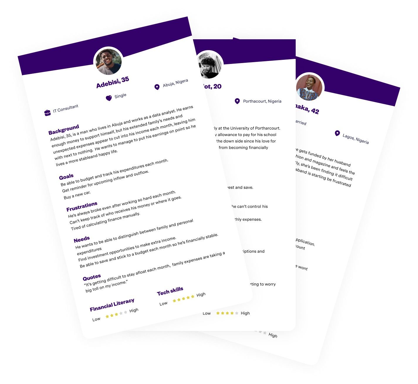
I built a set covering the range the app had to serve, from someone nervous about losing money for the first time to a confident investor who wanted detail on demand. Each profile set out what that person wanted, what worried them and what would make them give up. From then on, every design decision was checked against them rather than against personal preference.
Information architecture
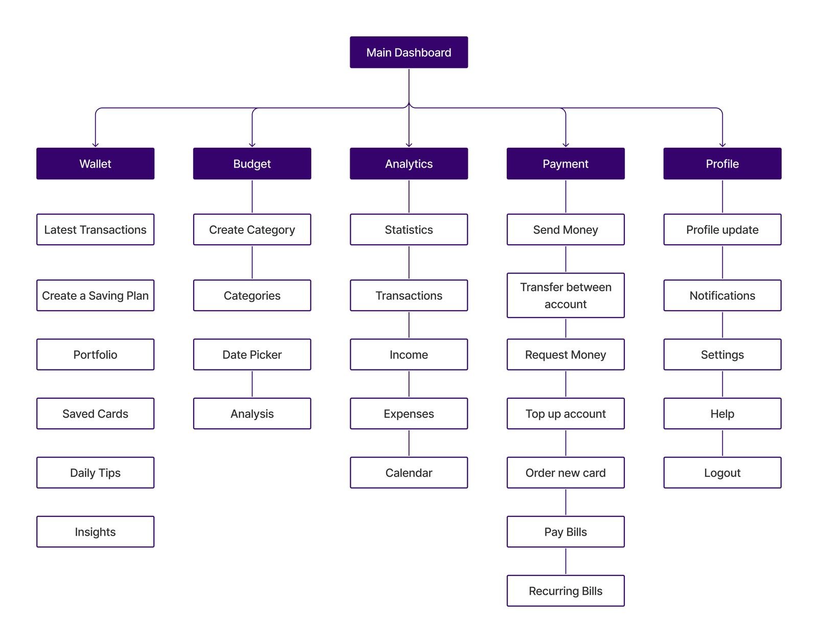
Before designing any screen I worked out how the whole app should be organised: what sits at the top level, what belongs underneath it, and what a person should be able to reach without hunting. The app covers a lot, savings, budgeting, investments, payments and analytics, and putting all of that in front of someone at once is the mistake most of the competitors were making. I settled on a small number of main areas with everything else nested beneath, so the app stays navigable as more features are added. Agreeing this early saved a great deal of argument later, because the structure was already decided when individual screens came up for discussion.
User flows
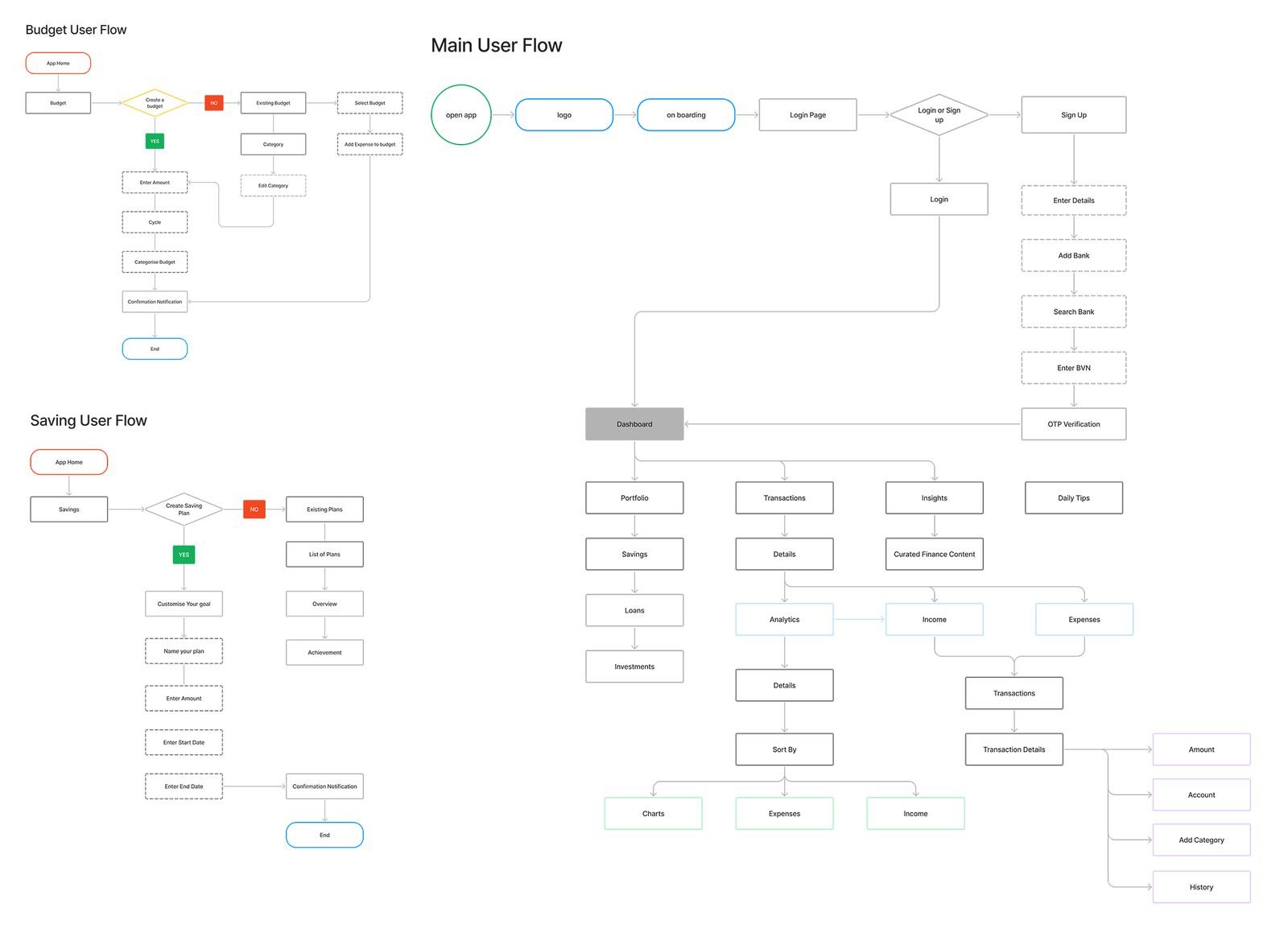
I mapped the tasks that mattered most, signing up, linking a bank and setting a savings goal, including every point where someone could go wrong or drop out. Laying each route out in full makes it obvious where a step is unnecessary or where someone could get stranded with no way forward. Signing up turned out to be the riskiest stretch, because that is the point where an unsure user decides whether the app is worth the effort, so it got the most attention. These flows also gave the developers a clear reference for what needed building.
Design
With the research settled, I moved on to the layout of the app itself, working out what belongs on each screen and how someone moves from one to the next, before any of it was styled
Wireframing
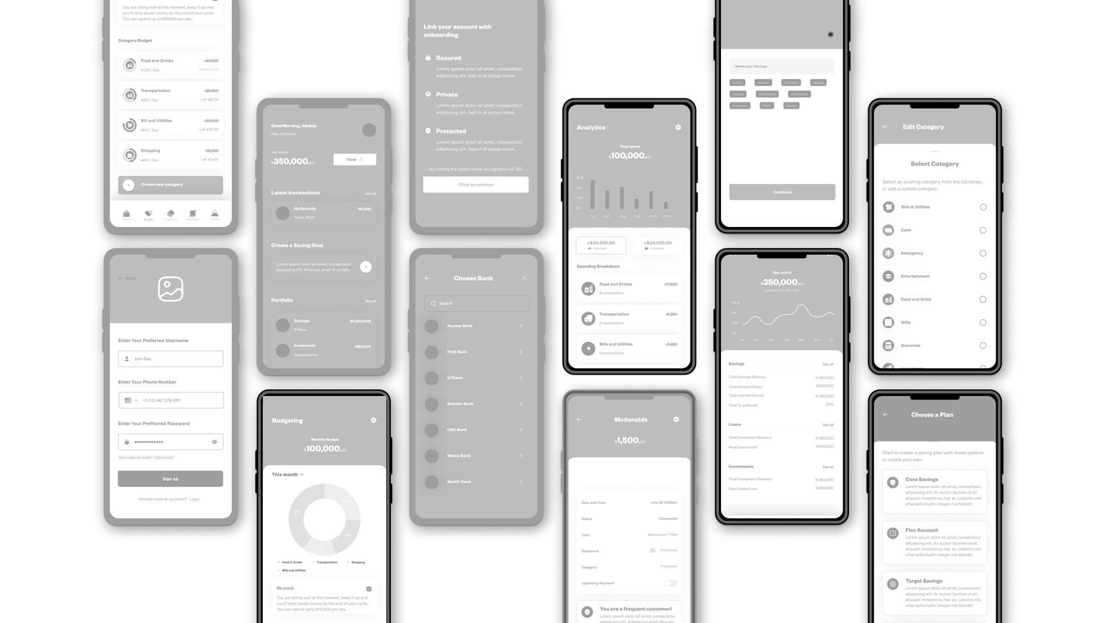
I drew several versions of each screen so ideas could be compared and discarded quickly. Keeping them rough is the point. Nobody gets attached to a sketch, so the conversation stays on whether the structure works. Once the flow held together, I added enough detail to put the screens in front of real users.
Usability testing
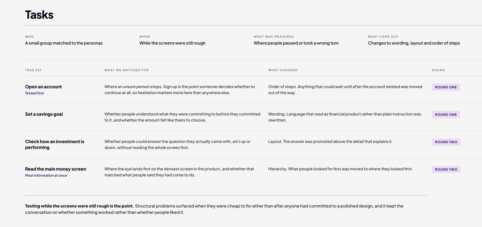
Participants were recruited against the personas. I defined the tasks they were set, realistic jobs such as setting a savings goal or checking how an investment was performing, and what each round needed to answer. Watching where they paused or took a wrong turn told us far more than their answers afterwards did, because people are consistently poor at explaining their own confusion. The sign up flow went first, since that is where an unsure user decides whether to continue, then the main money screen, because it carries the most information at once. Each round produced specific changes to wording, layout, hierarchy and the order of steps, which went straight into the next version.
Delivery
We launched with a first working version covering the essentials rather than every feature on the wish list. Saving, investing and seeing where you stand made the first release. Anything that was not one of those three was pushed to a later one, which is what made six months possible. The screens shown are the design as delivered.
I led the visual design. The research said people were nervous rather than confused, so the interface had to feel calm and certain rather than energetic. A single deep primary with a small set of supporting tones keeps it quiet and reserves colour for the things that carry meaning, such as money in and money out. Typography was chosen for legibility at small sizes and for clear separation between a figure and its label, since almost every screen is someone reading a number. The icon set was drawn by the illustrator I worked with, to a brief and grid I set.
App screens
Some of the screens designed for the app, and the thinking behind each one.
Onboarding screens
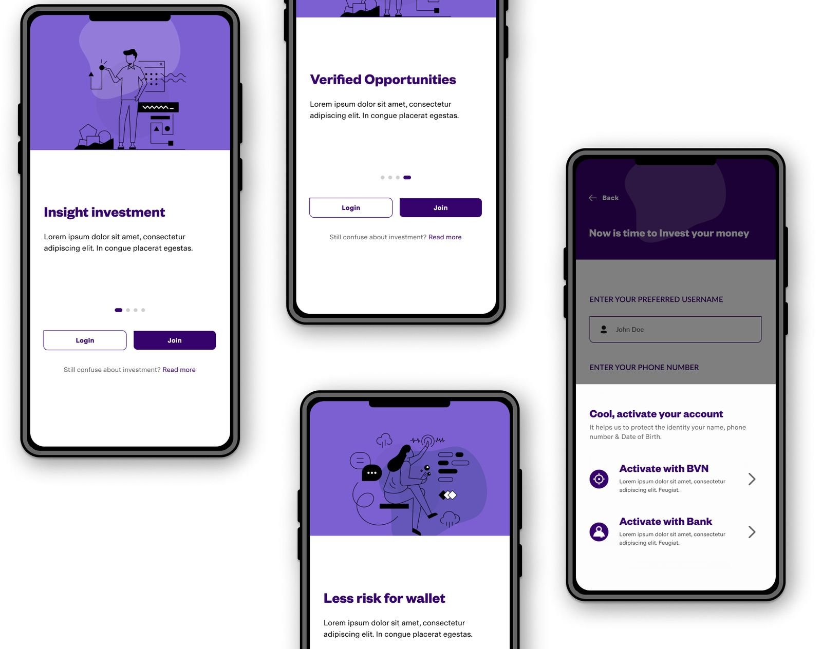
The instinct with onboarding is to explain everything, and the research said the opposite: every screen before someone reaches the product is a chance to lose them. I cut the sequence to the minimum that still made the purpose clear, kept the animation minimal so nothing delays entry, and added a skip button for anyone who would rather get straight on with it. Explanation was moved into the product itself, where it arrives when someone actually needs it.
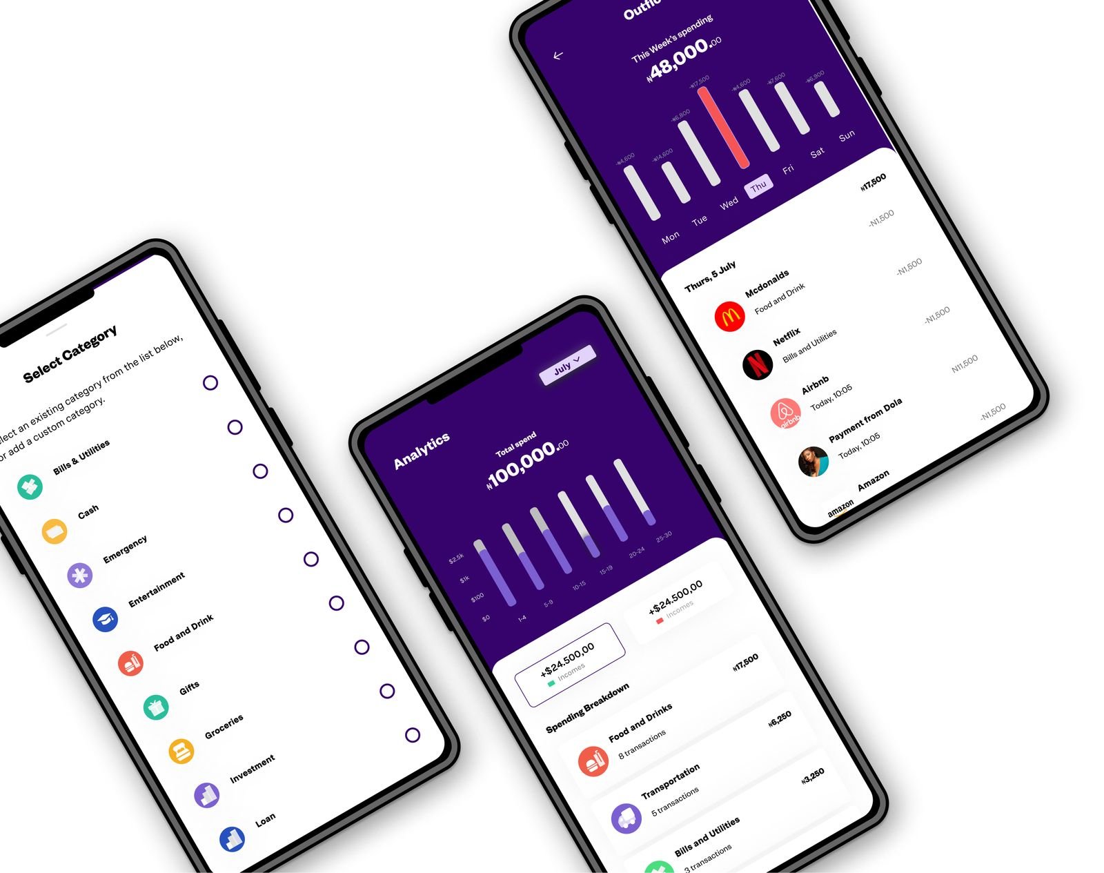
Analytics
The hard question here was the default time period. Show too much history and a beginner cannot read the chart; show too little and a regular user has to keep adjusting it. I settled on a short default with a single dropdown to change it, rather than a set of filters, because one control that everyone understands beats several that only confident users touch.
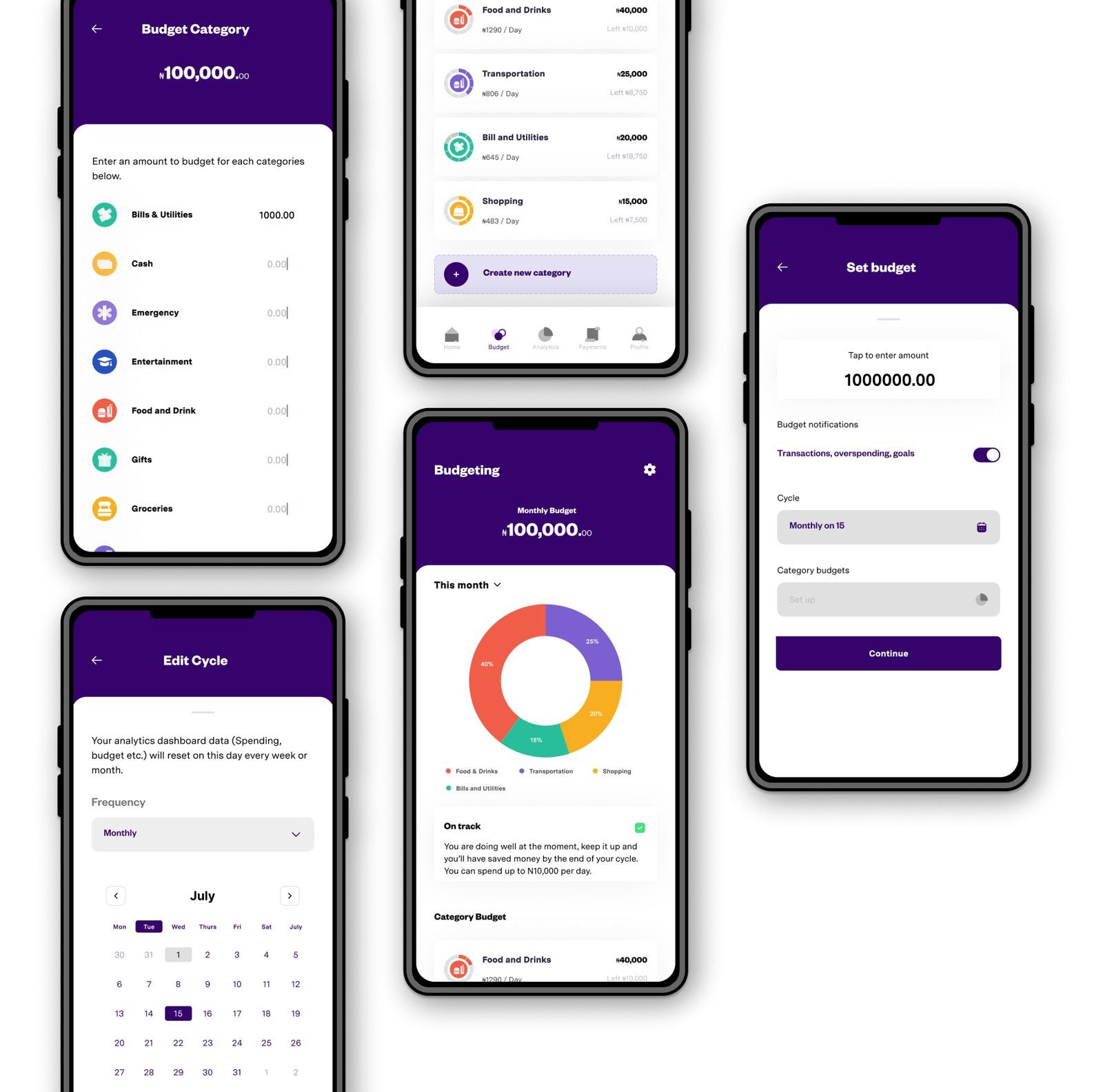
Budgeting
This screen carries the most information of any in the app, so every element had to earn its place. I used green and red for the charts because almost everyone already reads them as money in and money out, which removes the need for a key. Spending categories pair a name with an icon so the list can be scanned rather than read. Anything that needed a legend to make sense was cut.
App home
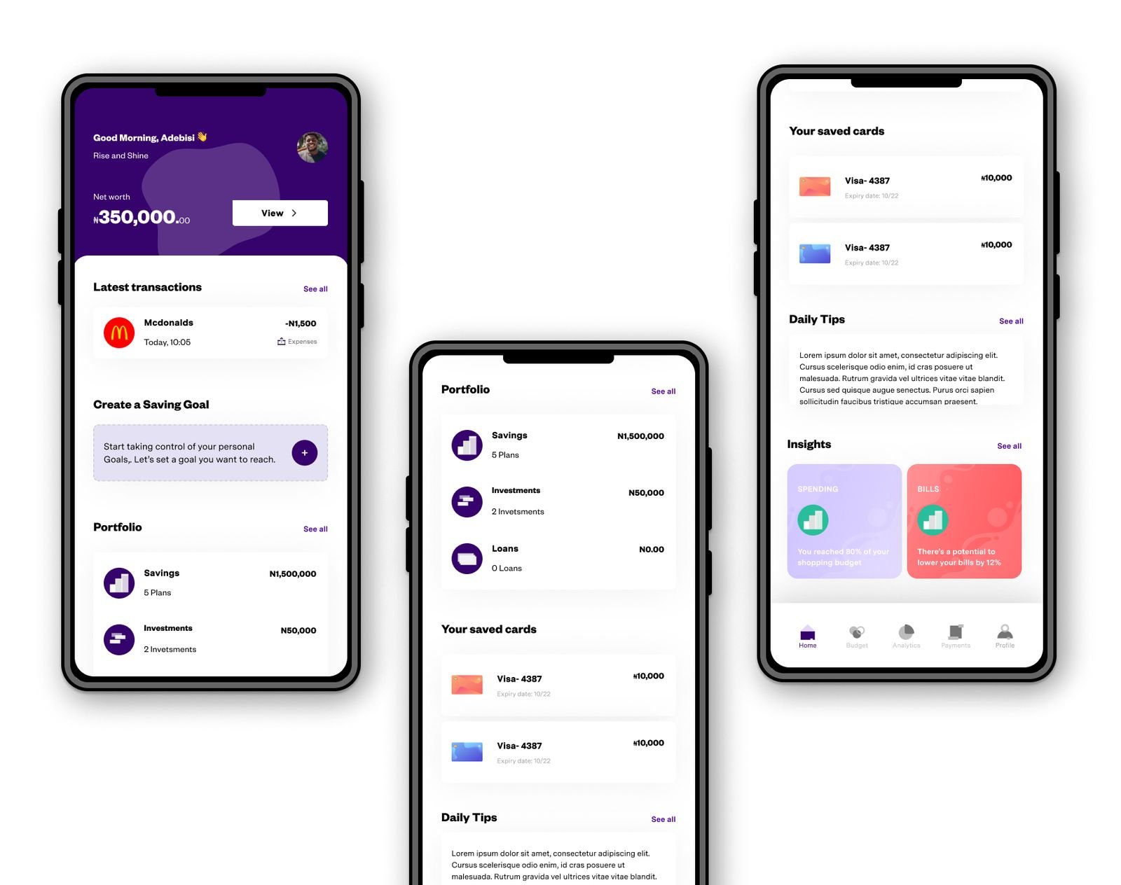
Research said people wanted one screen telling them where they stand, so this one answers that before anything else: what you have, what you owe, and what you have spent this month. Below that sits a short prompt suggesting what to do next, which is where the app earns repeat visits. Everything else was pushed a level down rather than competing for the same space.
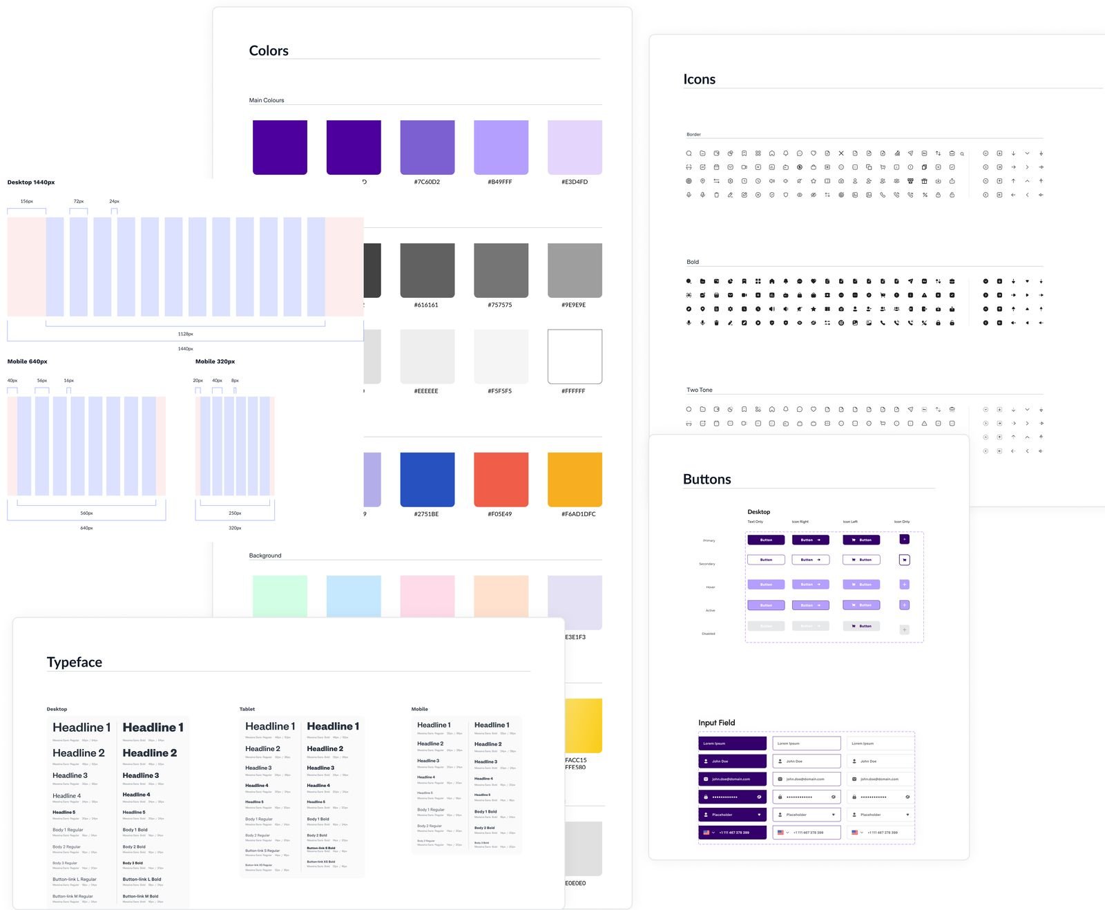
Design system and guides
Buttons, forms, charts, colour and type, with written rules for how each is used, so a new screen could be assembled from parts that already worked rather than designed from scratch.
I built it alongside the two developers on the project, so that what was specified could actually be built and nothing had to be reworked in code. The result was a toolkit the in house team could use to add features later without the product drifting out of shape.
Validation
The app soft launched with over 2,000 members already subscribed. Getting a product from research to a live release, in a category where most never ship at all, is the part I am most pleased with, but the launch itself was where the design was actually tested.
What the soft launch changed
Two things surfaced within days of going live, and both changed the product rather than sitting in a report.
Verification. Large numbers of members were completing sign up with unverified phone numbers and email addresses, and the support team was calling them individually to find out why. The fix was to stop treating verification as something that happens after sign up. We built one time passcode verification into onboarding, so a member confirms their number at the point of joining rather than being chased for it later.
Borrowing before saving. A large share of new members went straight to a loan application, in a product built to help people accumulate wealth rather than take on debt. That pattern was a signal, not a success. We reordered the product so saving leads, and added a credibility step before anyone can borrow, including a credit status check that had not existed at launch. Borrowing is still there, but a member reaches it after establishing some standing rather than on arrival.
Where it stands
The app went into public use and is still running, with the design system and structure we established carrying the features added since. The brand was rebuilt with agency Fourth Canvas, working from the product and the audience understanding this stage produced.